Swiss Drop Cards
Your feature drop, in eight image formats.
Available to try
The complete beta package supports your brand, content and action link. Formal quality acceptance is still in progress.
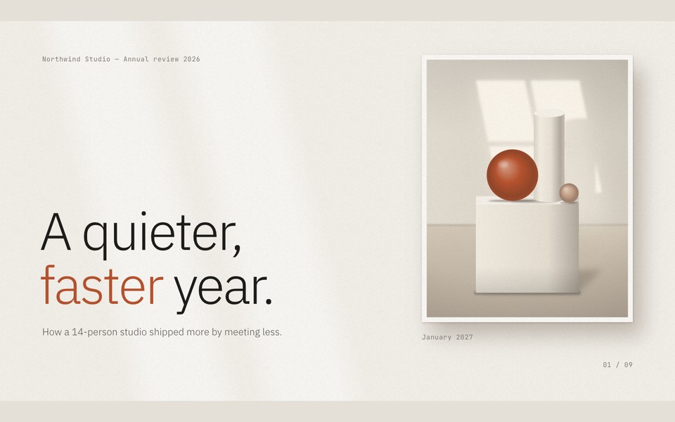
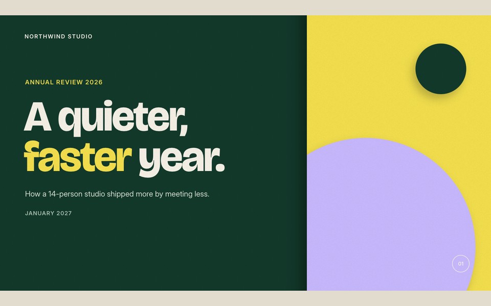
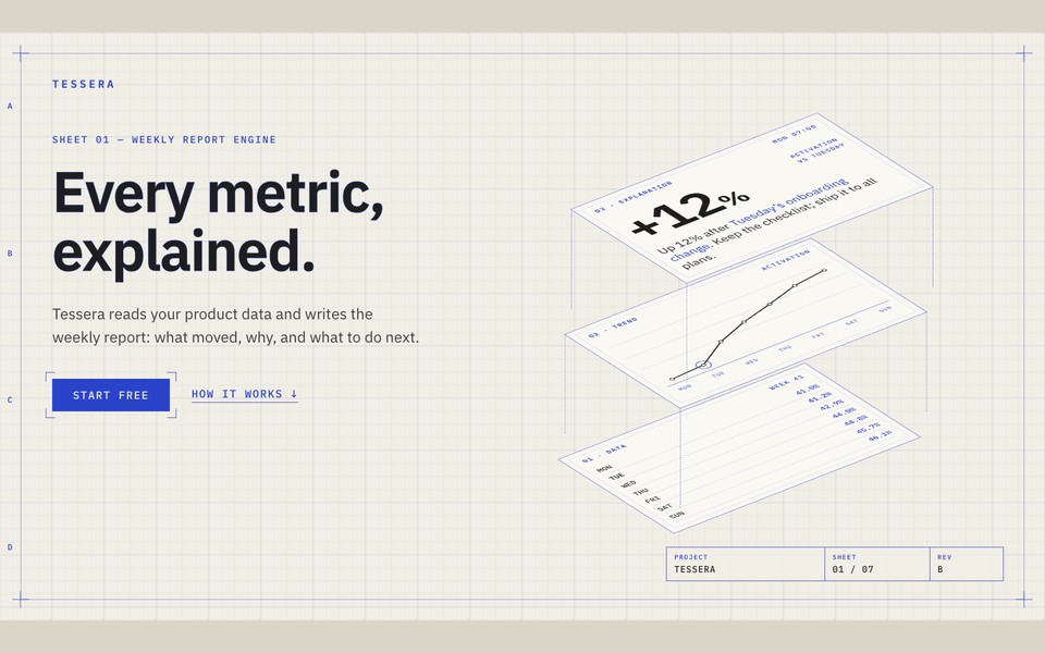
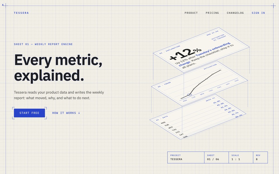
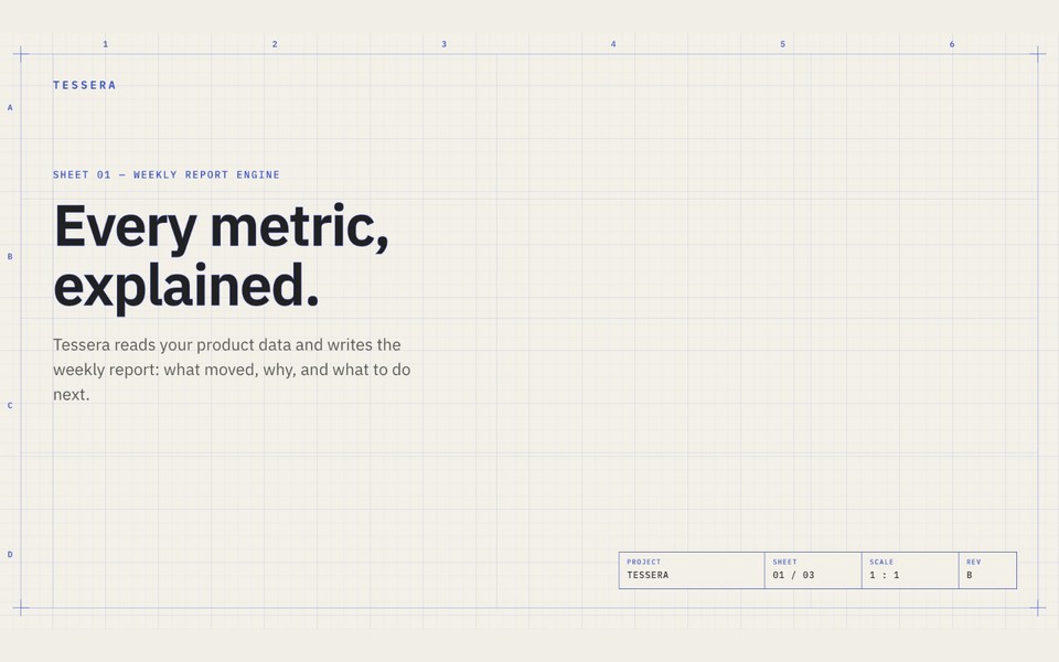
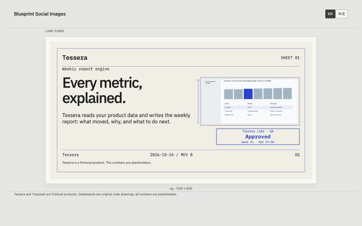
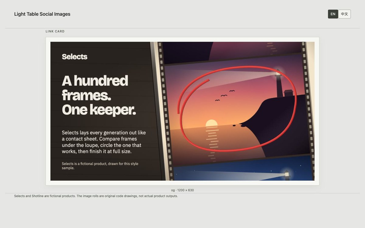
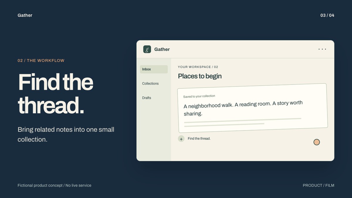
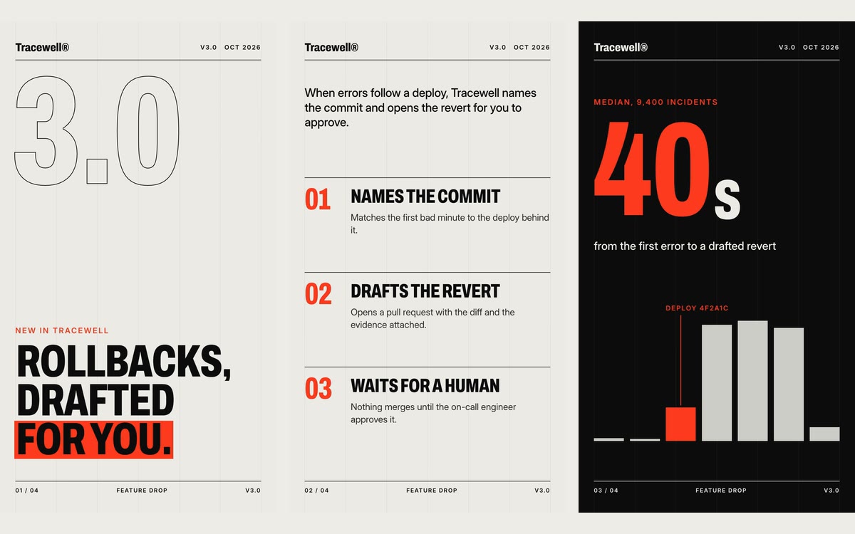
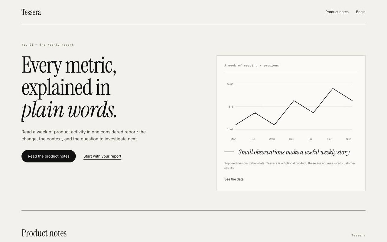
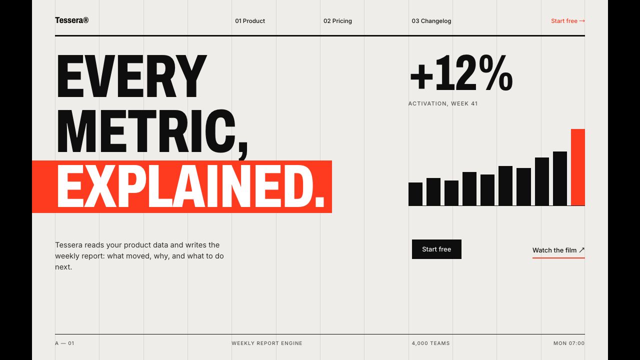
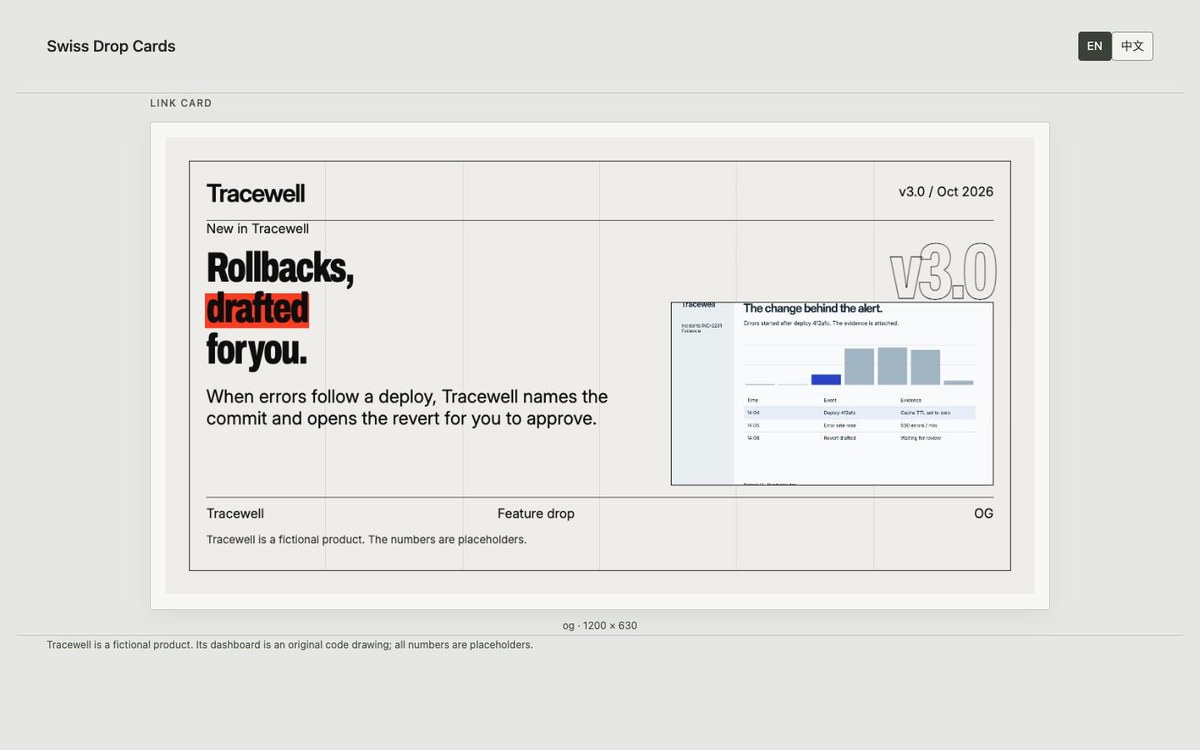
A social image companion to Swiss Feature Drop, built from the same drop.json. The six-column grid, outline version number, condensed headline and signal-red accent line adapt to link previews, wide and square feeds, stories, GitHub and a three-image Product Hunt gallery. Add screenshots in grid cells with a chosen crop, or work with type and drawing alone. A local build measures every text box and exports eight PNGs with a contact sheet.
- Preview format
- PNG · HTML
- Palette
- #eeede9#0e0e0e#ff3b1f
Extract the swiss-drop-cards.zip I provide and read swiss-drop-cards/SKILL.md. Install the complete folder in the current agent's project-level Skill directory, keeping scripts, references, examples, fonts and their licences. Use my drop.json, shared with Swiss Feature Drop. Add local screenshots through social.screens with alt text and focal coordinates, then run node scripts/build.mjs <input.json> <outdir>. It needs Node.js 22+ and installed Chrome or Chromium; no npm dependencies or network assets. Deliver all eight PNGs and contact.html, fix fit failures, and list every placeholder. This is a beta package.